XQ Dashboard Reports contain data and graphics that reveal key insights into your Workspace’s communication activities. This article provides an overview of reports and guidance for understanding reports.
Overview
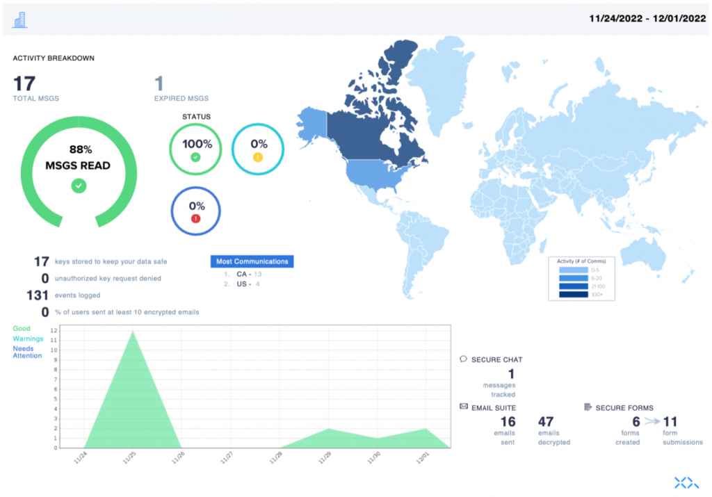
XQ Dashboard Reports are sent as a PDF file. The data shown on the report will reflect the time period you chose when generating the report. The dates for the chosen time period are displayed in the top-right corner of the report.
Activity Breakdown
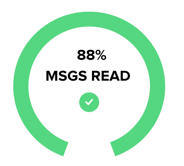
The activity breakdown section of a report contains the following data and graphics:
- TOTAL MSGS – This data value represents the total number of team communications.
- EXPIRED MSGS – This data value represents the total number of expired team communications.

- MSGS READ – This graphic displays the percentage of communications read.
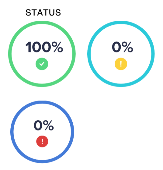
- STATUS – These graphics display the percentage of communication statuses. Possible communication statuses are Good, Warning, or Needs attention.
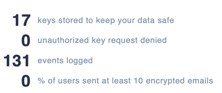
- Keys stored to keep your data safe
- Unauthorized key request denied
- Events logged
- % of users sent at least 10 encrypted emails
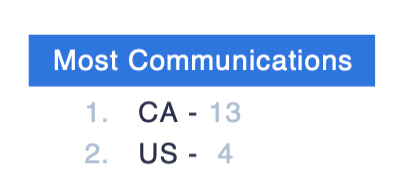
- Most Communications – This list displays the countries with the greatest number of communications.
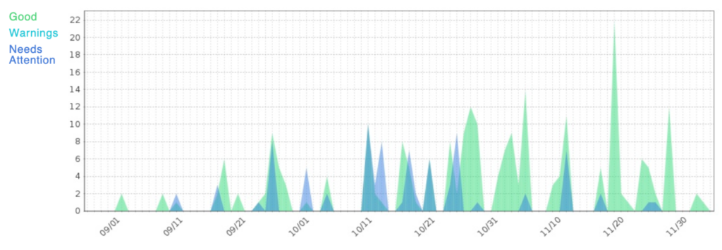
Status graph
The status graph section of a report displays the number of each communication status in a given time period. Possible communication statuses are Good, Warning, or Needs attention.
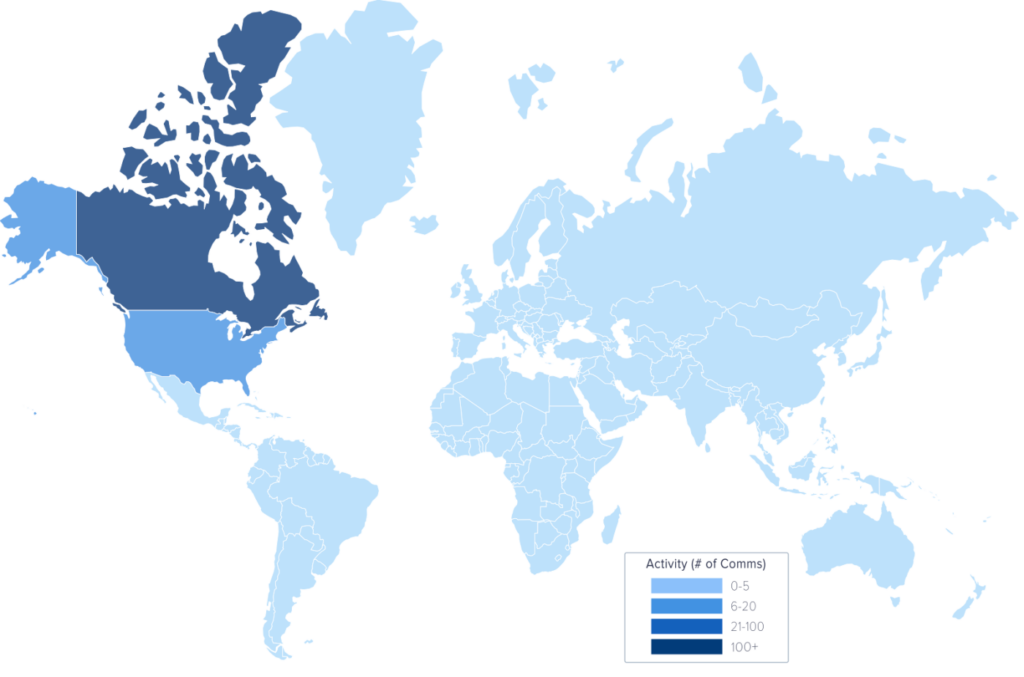
World Map
The world map section of a report displays the number of communications by country in a given time period. Use the map’s Activity key to determine the number of communications. For example, in the following world map, the US has 6-20 communications.
Product Insights
The product insights section of a report provides data for each of the XQ products you use. This section may differ depending on what products you have enabled in your XQ Dashboard.
For an overview of all XQ products, visit xqmsg.co and click Products from the top navigation menu.

Leave a Reply